If you’re a developer transitioning from traditional coding to visual app builders, FlutterFlow might surprise you—in a good way. It’s designed to bridge the gap between full-code flexibility and low-code speed, giving coders a faster way to build without sacrificing too much control. In this post, we’ll explore how developers can adapt to FlutterFlow, uncover some handy tricks for responsiveness, and share workarounds for common limitations.
Trick to Responsiveness
FlutterFlow makes basic responsiveness easy, especially when adjusting things like font sizes or padding. But when you’re trying to support tablets or desktops, layout changes can get tricky.
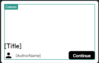
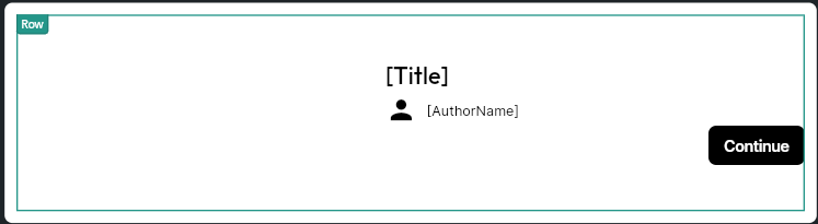
Most developers coming from code will expect to use Flex or Grid systems. Instead, FlutterFlow relies heavily on Column, Row, Stack, and Container components. Typically, you start with a mobile-first layout using Columns. But when you scale up to tablets or desktops, you may need to switch that Column to a Row to take advantage of horizontal space.
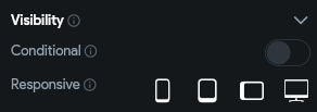
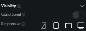
The Visibility property is going to be your best friend—not just for making your app responsive, but also for showing or hiding things like dynamic variables that might sometimes be null.
With Responsive Visibility, you can control whether a component shows up on different screen sizes: portrait mobile, portrait tablet, landscape tablet, or desktop.
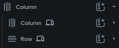
How to swap Column for Row based on screen size:
- Place both the Column and Row in your widget tree.
- Use the Visibility property to show the Column only on phones.
- Show the Row only on larger screens (tablet, desktop).

Example for Column component:
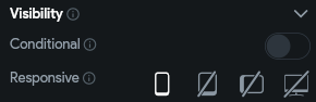
Example for Row component:
Just keep in mind that you’ll need to have both components in your widget tree at the same time, even though only one will be visible at any given screen size.
Make-Shift Toggle Icon
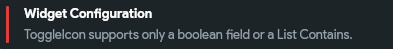
FlutterFlow does have a Toggle Icon component—but it comes with a key limitation: it only works with a direct boolean field or a list contains condition. What does “direct” mean? It means the boolean field can’t be nested inside a custom data type or a document reference.
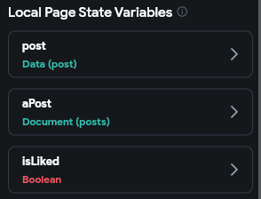
Take a look at these page state variables for instance: post (a custom data type) or a document from the posts collection—both of which include a boolean field called isLiked. If you try to bind the toggle value to post.isLiked or document.isLiked, you’ll run into that error. The toggle only works if you link it directly to a top-level boolean variable like isLiked, or if you use the list contains condition. Otherwise, the toggle icon just won’t function as expected.
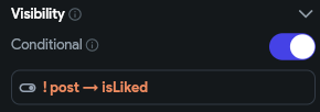
This is a common setup. So how do we solve this issue? Once again, we’ll use the reliable Visibility property! Two icon buttons of outlined and filled icons. Their tap action will set the boolean variable to the value opposite to its current value.
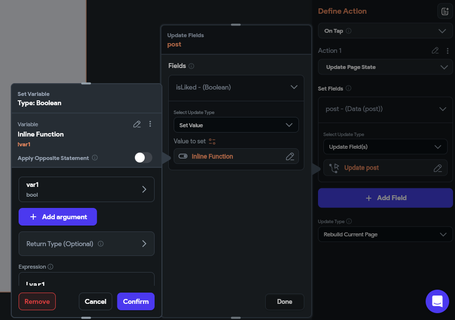
Then enable conditional rendering for both. Render the border icon with the not logic while the filled icon without the not logic.
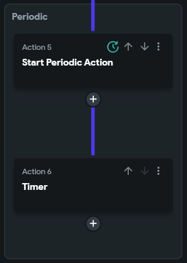
Functioning Timer
A timer with controls is fairly easy and should be enough knowledge for you to implement an automatic timer. But, it isn’t as intuitive as it seems. The difference is not having the functions of the timer controls – pause and play. These controls have actions that allow you to control the timer. When you don’t need those controls, what actions do you use?
Periodic Action – action that runs a chain of actions periodically. It’s a very useful action you can use not just for timers, and for functions that need to run every now and then. Finally, set the properties of the timer accordingly
Conclusion
FlutterFlow opens up a powerful low-code path for developers who are used to writing everything by hand. While it comes with some quirks and limitations, knowing how to work with things like responsive visibility, toggle icons, and periodic actions can make a big difference. With the right approach, coders can speed up development without giving up the precision they’re used to.
🌸 25% OFF All Reviewers on our International Women’s Month Sale! Save 10% OFF All Subscriptions Plans & 5% OFF Store Credits/Gift Cards!

Learn AWS with our PlayCloud Hands-On Labs

$2.99 AWS and Azure Exam Study Guide eBooks

New AWS Generative AI Developer Professional Course AIP-C01

Learn GCP By Doing! Try Our GCP PlayCloud

Learn Azure with our Azure PlayCloud

FREE AI and AWS Digital Courses

FREE AWS, Azure, GCP Practice Test Samplers

Subscribe to our YouTube Channel

Follow Us On Linkedin


Written by: Douleia Yap