If you’ve tried Lovable, v0, or Bolt.new, you already know the pattern: describe what you want, get a working app back. Now there’s a new tool in that same space — Google Stitch.
Google Stitch is different. It’s an AI tool built specifically for UI design, not app generation. It focuses on what your product looks like, how the screens connect, and how users move through them. It also exports to Figma with the layer structure intact, which is the part I actually care about.
I do a lot of Figma work, and there are times when I sit down to design and my mind just goes completely blank. Stitch basically solves that problem by giving me a real starting point I can actually work with instead of a template that looks like every other app on the internet.
To keep things concrete, this post builds a real project from start to finish: a notes-to-flashcard web app where users upload a PDF and the app generates flashcards from the content. Each section introduces a Stitch feature by actually using it to build the next part of the app.
What Is Google Stitch?
Stitch started as Galileo AI, a startup Google acquired in early 2025. At its core, it takes an input (text, image, or sketch) and returns a styled, structured UI with the corresponding HTML and CSS.
You access it at stitch.withgoogle.com. A Google account is all you need. No installs, no setup.
It runs two AI modes:
- Standard Mode uses Gemini 2.5 Flash. It’s faster, gives you 350 generations per month, and supports Figma export.
- Experimental Mode uses Gemini 2.5 Pro. Higher fidelity, accepts image inputs like sketches and wireframes, but caps at 200 generations per month and doesn’t support direct Figma export.
The March 2026 update added an AI-native infinite canvas, multi-screen generation, and voice input. It also introduced a design agent that reasons across your entire project history. It’s a noticeably different product from what launched at I/O.
Now let’s actually build something with it.
Step 1: Generate Your First Design with the Global Style System
The most underrated thing Stitch does is build a consistent design system from a single prompt, not just a single screen.
Here’s the prompt we’ll use to kick off the flashcard app:
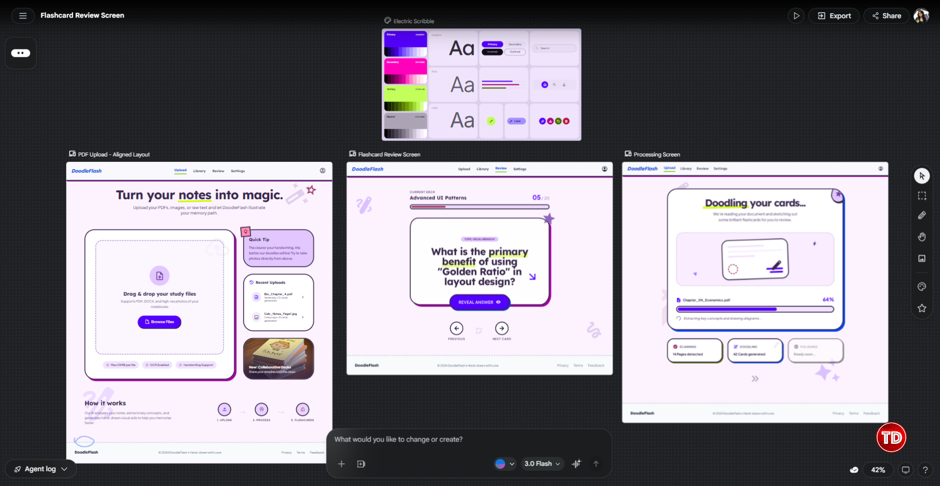
“A notes-to-flashcard web app. Three screens: a PDF upload screen where users drag and drop or browse for a file, a processing screen showing progress while the app reads the document, and a flashcard review screen where users flip through cards one at a time. Bright and fun theme, neon color palette, rounded card components, accessible typography, with a doodle theme and elements on light theme.”
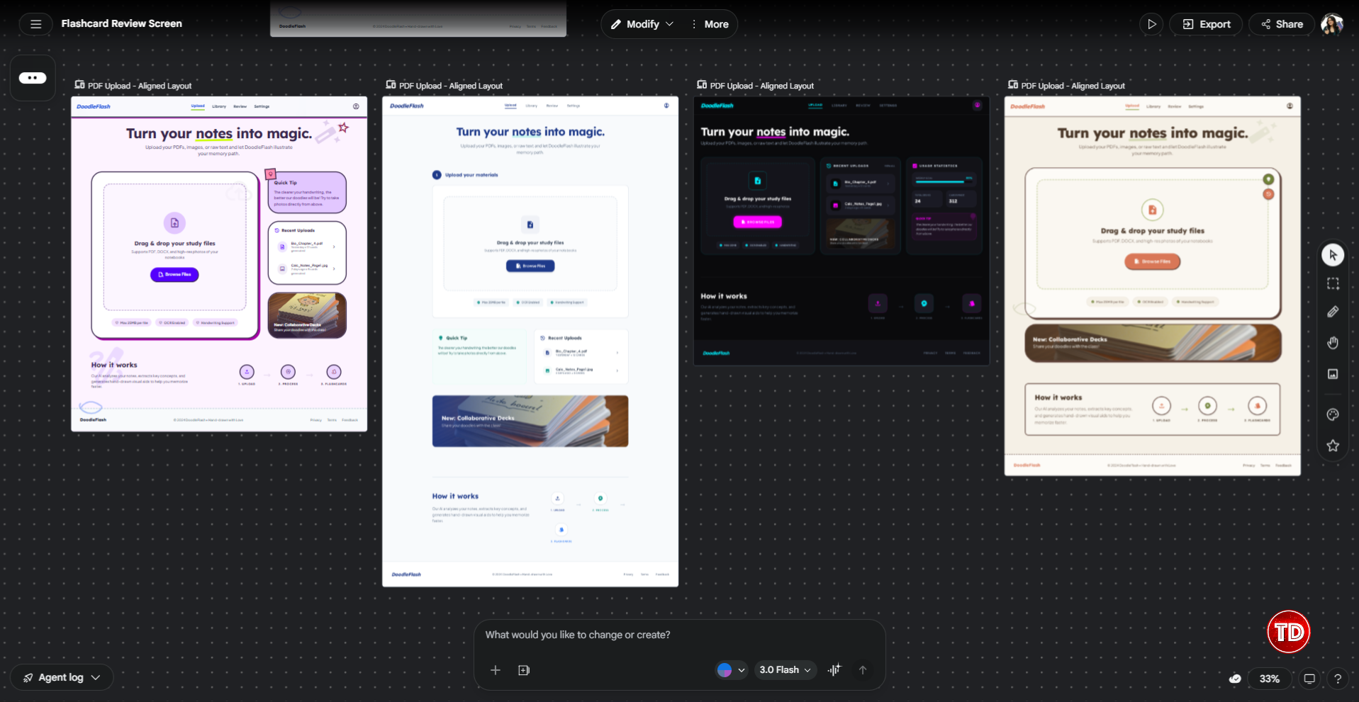
From that one prompt, Stitch generates all three screens and applies a consistent global style across all of them: a shared color palette, a typographic scale for headings and body text, matching corner radii on cards and buttons, and spacing that stays coherent from screen to screen.
This matters a lot in early-stage work. When you’re still testing an idea, you don’t want to spend time manually defining color tokens and type scales.

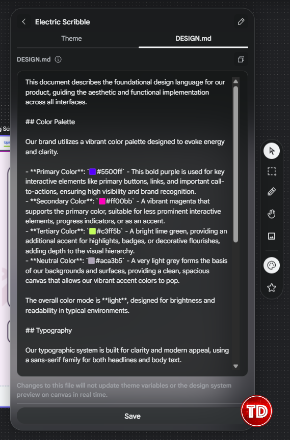
From March 2026, you can also import your own brand rules via DESIGN.md, a markdown file you can carry between projects. You can also extract a design system from any existing URL. Useful when you need to match an existing product’s visual language.
One thing to keep in mind: Stitch defaults to conventional design patterns. If your prompt is vague, the output will be generic. The more specific you are about visual direction and screen structure upfront, the better the first pass will be.
Step 2: Tweak the Design System and Make Precise Edits
Once you have your first pass, Stitch gives you three ways to refine it: adjusting the design system to match your vision, making surgical edits to specific elements, and generating variations to explore different design directions.
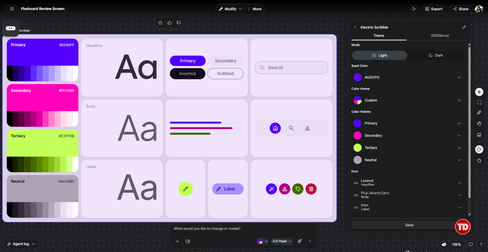
Design System
After the initial generation, Stitch exposes the design system it built from your prompt. This is where you can go in and adjust the specifics: swap the primary color, change the typeface, tighten the corner radius, update spacing values. Any change you make here applies globally across all generated screens at once, so you’re not hunting down every button and card individually.
For the flashcard app, this is useful for locking in the indigo palette properly. Stitch might interpret “indigo” slightly differently than what your brand actually uses, so opening the design system panel and setting the exact hex value ensures everything stays consistent before you go any further.
It’s also worth checking the typography here. If Stitch picked a font that doesn’t feel right (too decorative, too aggressive), the design system panel is where you swap it out globally rather than fixing it screen by screen.
One thing I’ll be upfront about: the design system feature is a bit tricky to use. I spent some time swapping between different design systems and nothing was changing on the screens. Turns out the update doesn’t apply automatically. You have to select all your screens first, then click Modify, go to Design System, and select the updated color system from there. Easy to miss if you’re just clicking around expecting it to sync on its own.
I also noticed that even after applying the changes, the difference isn’t always obvious. Some color swaps are subtle enough that you might wonder if it worked at all. That’s why I’d say put more energy into getting your first prompt right, specifically the color direction and visual style, rather than relying on the design system panel to fix things after the fact. The prompt is where you have the most control.
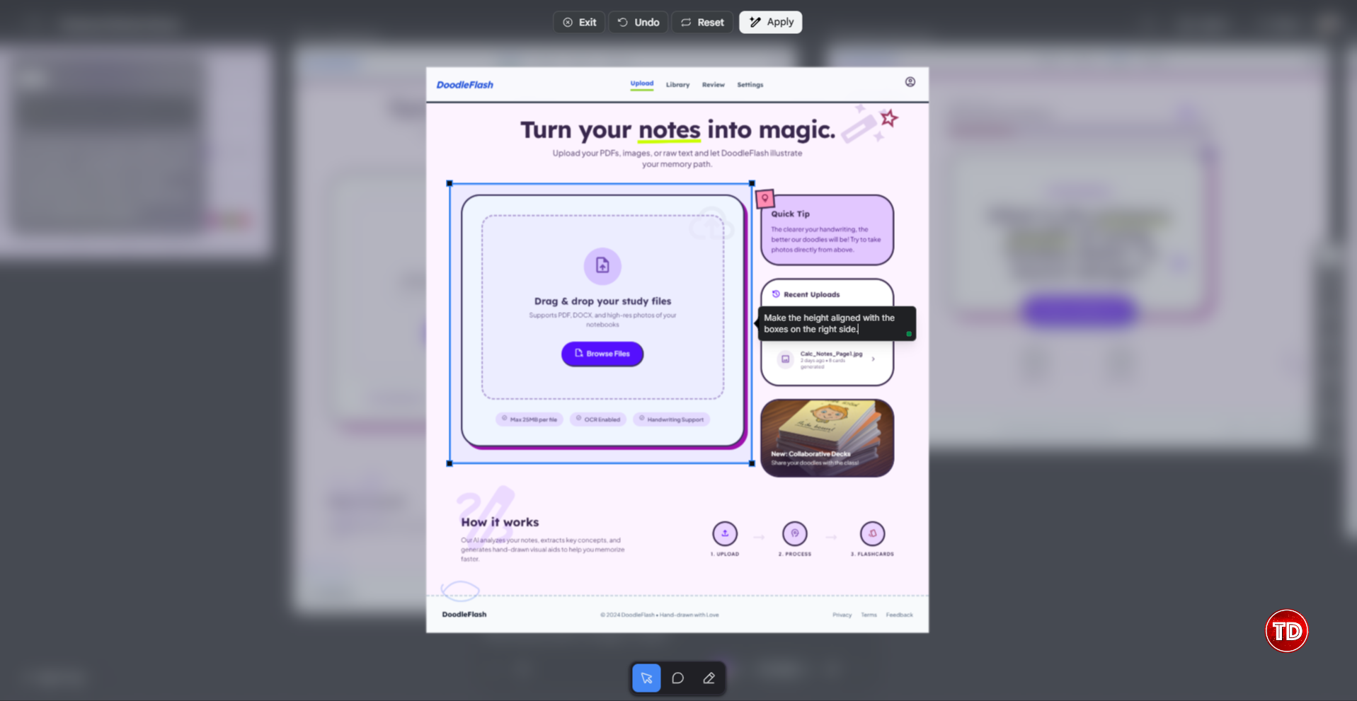
Annotate
Annotate is the feature for precise edits. Instead of re-prompting the whole design, you draw a selection box around a specific element on the canvas and type your instruction directly into the text bubble that appears. Stitch then applies that change to just that element and leaves everything else alone.
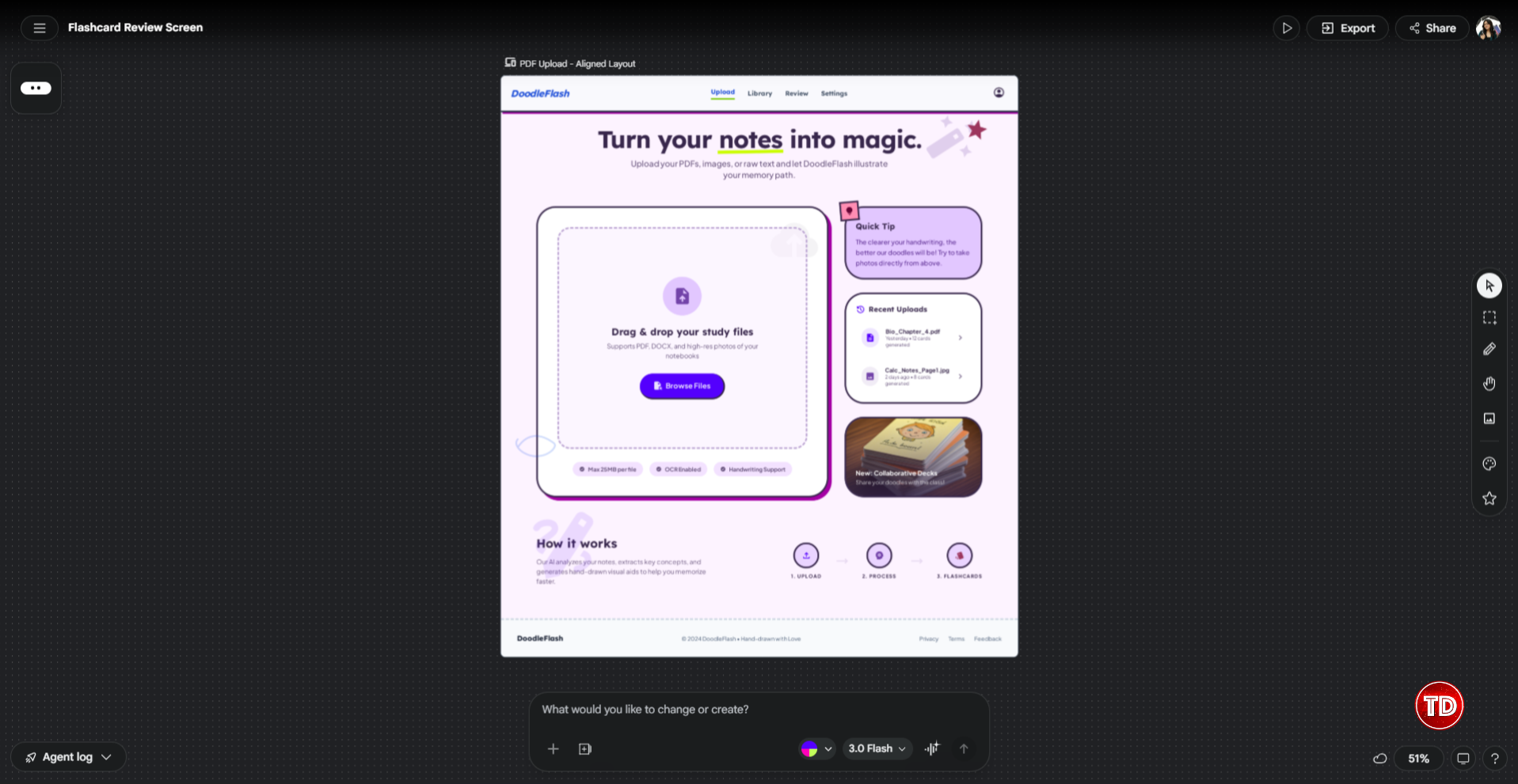
In the screenshot below, the drag and drop upload area on the left panel was selected and the instruction was “Make the height aligned with the boxes on the right side.” That’s it. One targeted note, one fix. The rest of the screen, the nav, the Quick Tip card, the Recent Uploads panel, all of it stays exactly where it was.
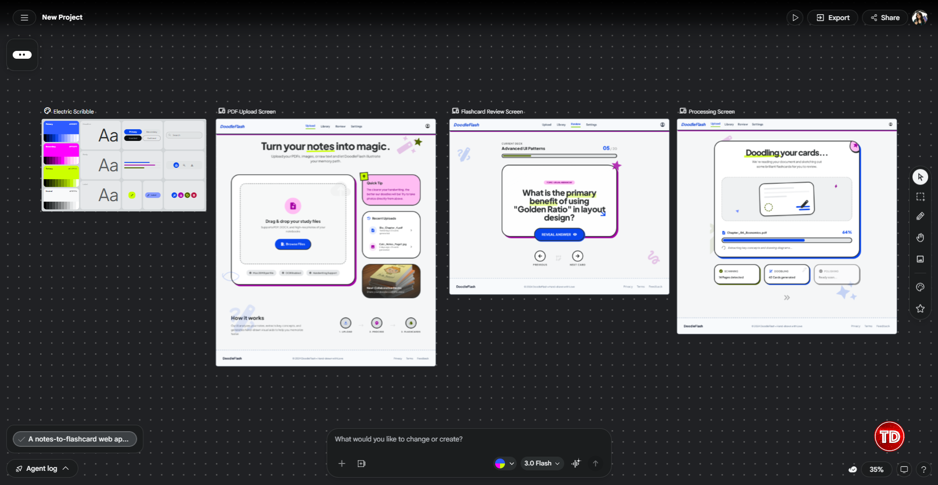
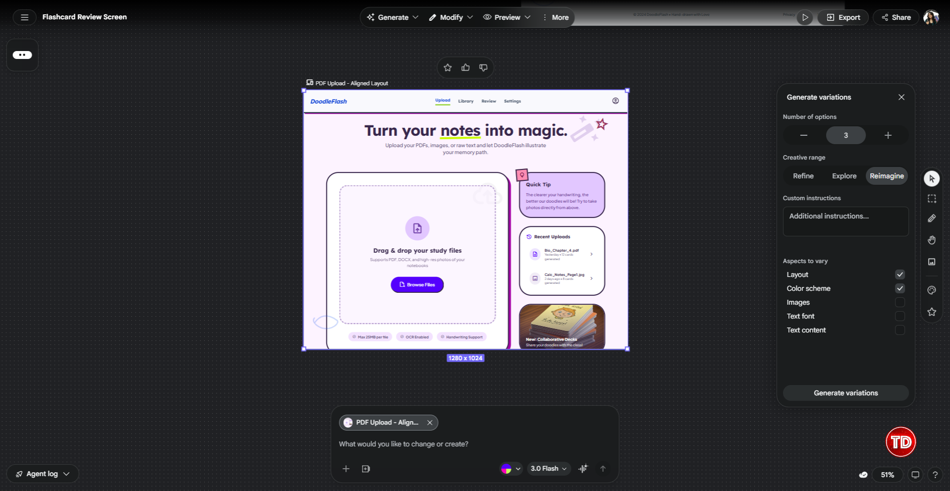
Variations
Variations is the third way to iterate, and honestly one of the most useful features in Stitch. You select a screen, open the Generate Variations panel, and Stitch produces multiple design takes on that same screen all at once right on the canvas.
The panel gives you a few controls worth knowing:
Number of options lets you choose how many variations to generate at once. The default is 3, which is a good starting point.
Creative Range is where it gets interesting. This is where you control how different you want the variations to be from the original. There are three settings: Refine keeps things close to what you already have and just tweaks the details, Explore introduces more noticeable layout and style changes, and Reimagine throws out more of the original and goes in a different direction entirely. If you’re happy with the general structure but want to see a few alternatives, Refine is the right call. If you’re not sure the current direction is working, Reimagine is worth trying.
Aspects to vary lets you check or uncheck what Stitch is allowed to change. The options are Layout, Color scheme, Images, Text font, and Text content. In the screenshot below, Layout and Color scheme are checked while the rest are off. This is useful when you want to keep your brand colors locked but explore different layouts, or the other way around.
You can also add Custom instructions to guide the variations in a specific direction before hitting Generate.
What makes this powerful is the same reason looking at multiple designs beats reading through multiple prompts. Your brain processes visual comparison almost instantly. You glance at the spread, one of them immediately feels right, and you delete the rest.
Step 3: Predictive Heat Maps
Now that the screens look the way we want, it’s worth checking whether they’ll actually work for users before going further.
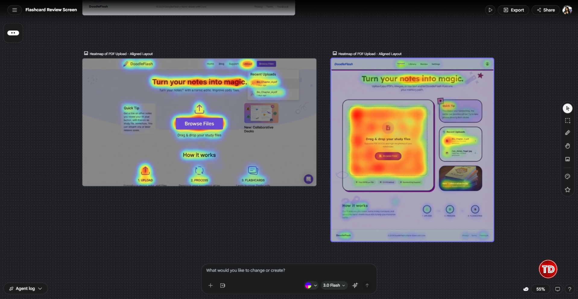
Stitch includes AI-generated heat maps that predict where users are likely to look and click on a generated interface. The AI analyzes layout structure, visual weight, element size, and placement to produce an overlay showing predicted attention and interaction patterns.
Run the heat map on the upload screen. You want predicted attention landing on the drag-and-drop zone and the “Browse Files” button. Looking at the right heat map in the screenshot below, that’s exactly what’s happening. The entire upload area is deep red and orange, the “Browse Files” button is the hottest point on the screen, and attention naturally trails off toward the sidebar. That’s a good sign the layout is working.
Now here’s something worth being upfront about: the heat map feature can be a bit unreliable. I ran it three times on the same screen and got different results each time. The left heat map in the screenshot below is a good example of this. It’s showing a completely different version of the DoodleFlash screen, with a different nav and layout structure, even though I was running it on the updated layout.
To be clear about what this is and isn’t: it’s a prediction model, not a substitute for real user testing. The heat maps are based on pattern recognition from training data, not the behavior of your actual users with your specific product. Use them as a directional signal during ideation and not as a replacement for qualitative research or A/B testing for anything going to production.
That said, as something you can run in under a minute, it’s a useful gut-check at this stage of the process, reliability issues and all.
Step 4: Export to Figma and Beyond
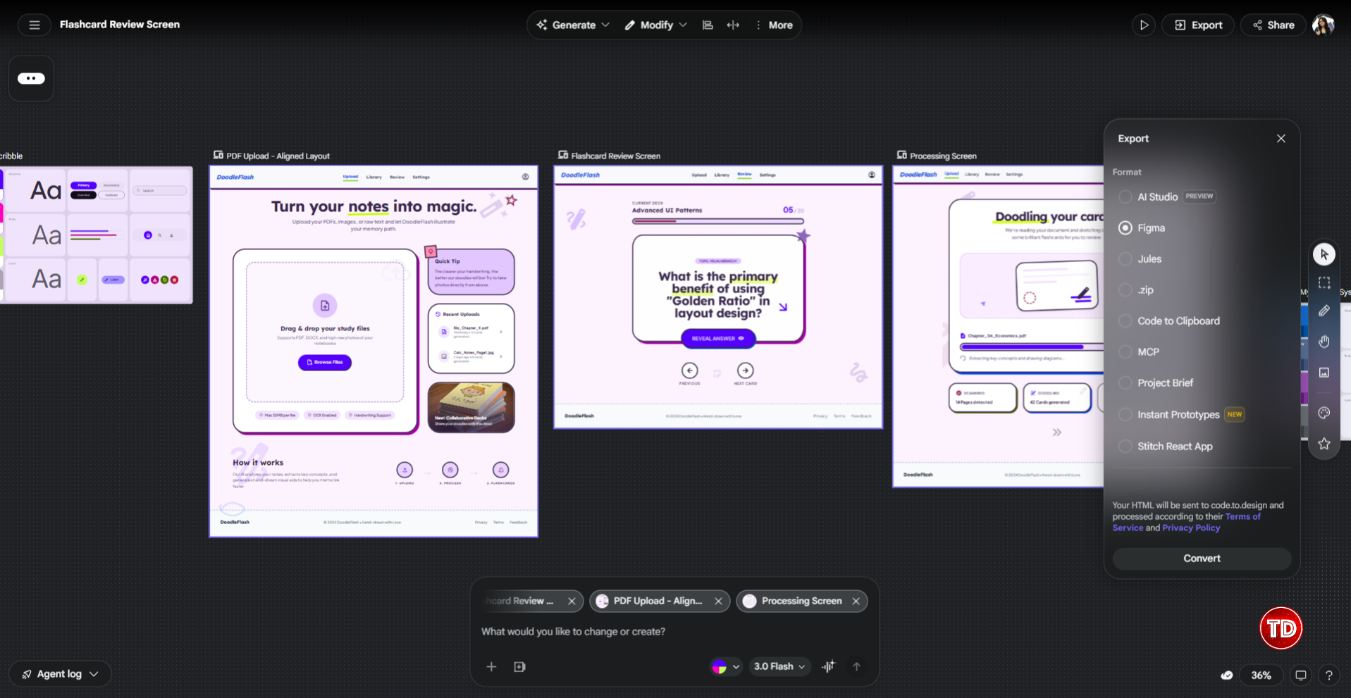
When the screens are ready, it’s time to get them out of Stitch and into your next tool. The Export panel has more options than you might expect.
Here’s everything available:
- AI Studio sends your design to Google’s AI Studio, which is useful if you’re building a Gemini-powered app and want to connect the UI to live AI logic. This is the fastest path if you’re staying inside the Google ecosystem.
- Figma is the one most designers will reach for. When you export to Figma, your HTML gets sent to code.to.design which processes it and converts it into a Figma file with Auto Layout intact. That step happens via a third-party service, so your design HTML passes through code.to.design as part of the process.
- Jules exports to Google’s Jules coding agent, which is useful if you want an AI to start writing the actual app code from the design.
- .zip gives you the raw HTML and CSS files. Good for inspecting the code directly or handing it off to a developer.
- Code to Clipboard copies the frontend code straight to your clipboard.
- MCP connects Stitch to coding tools like Cursor, Claude Code, or Gemini CLI through the Model Context Protocol. This is the option to use if you want a two-way loop between your design and your code editor.
- Project Brief generates a written summary of your design, useful for documentation or sharing context with teammates who weren’t part of the design process.
- Instant Prototypes converts your screens into a clickable prototype you can share and test without any additional setup.
- Stitch React App exports the design as a React application, which is handy if React is your stack and you want a starting point that’s already structured as components.

Inside the Figma Export
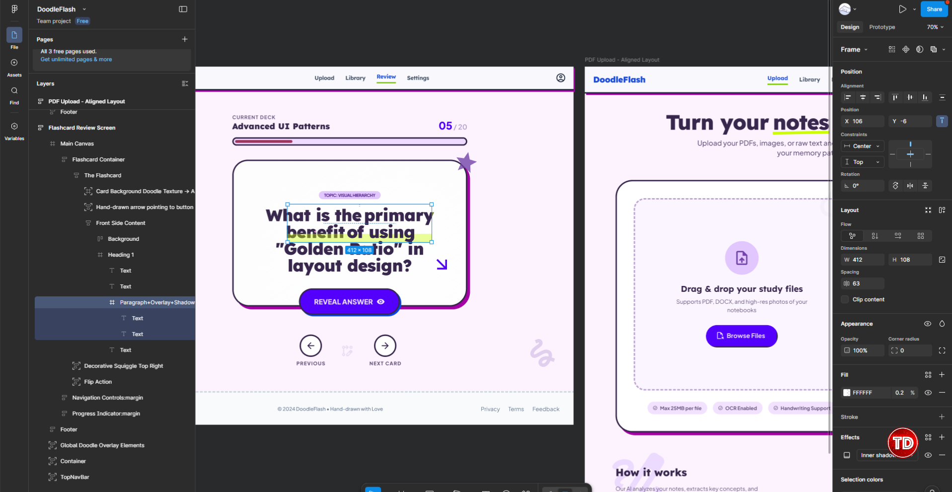
One thing worth noting: the exported Figma file isn’t pixel-perfect. It gives you a well-structured starting point with real styles and layout constraints. But you’ll still need to spend time in Figma cleaning things up, aligning to your brand tokens, and adding component states before it’s production-ready. Think of it as a strong draft, not a finished file.
After exporting DoodleFlash to Figma, a few things stood out. On the positive side, the layers are well named and logically arranged. Looking at the layers panel in the screenshot below, you can see names like “Flashcard Container,” “Front Side Content,” and “Flip Action”all stacked in a way that makes sense. A developer or a second designer picking this up wouldn’t have to guess what anything is.
The issue I ran into was with the underline styling on the flashcard question text in the review screen. In Stitch, the words “primary benefit” in the question have a neon green highlight underline that’s very visible and intentional. In Figma, that styling came through attached directly to the text layer, so you can’t select or adjust it independently. It’s a small thing, but the kind of thing you’d want to fix before showing it to anyone. You’ll need to manually recreate the highlight as a separate element in Figma to get it looking right.
So the export is genuinely useful as a starting point, just go in expecting to do some cleanup work on decorative details like that.
What Stitch Is Good For (And Where It Still Falls Short)
After going through that whole workflow with the flashcard app, here’s an honest summary.
- Where Stitch is useful: Getting from zero to something testable fast. Exploring multi-screen flows before committing to a full Figma file. It’s also practical for developers, product managers, and students who need to communicate design intent without deep Figma experience.
- The design system sounds better than it is. I thought this would be a standout feature, but it’s one of the most inconsistent parts of the tool. Changes often don’t visibly apply even after following the correct steps. And when they do, the difference can be too subtle to notice. Put your energy into getting the first prompt right instead.
- The Figma export is helpful but not clean. Layers are well named and Auto Layout is intact, which is genuinely useful. But decorative details like the neon green highlight don’t transfer correctly and need manual fixes in Figma.
- The heat maps are unreliable. Running the same screen multiple times can produce different results, and sometimes Stitch generates the overlay on an older version of your design entirely. Useful when it works, but run it a few times before trusting any single output.
The practical workflow: explore in Stitch, refine in Figma, build from the exported code. Stitch is promising and the speed is real, but it’s a tool that helps you start, not one that finishes the work. Designers aren’t going anywhere.
One last note: Stitch is a Google Labs experiment. Features can change, limits may shift, and Google has a history of discontinuing Labs projects. Export anything you care about and don’t build a production dependency on it.
For students and developers new to UI/UX, Stitch is a practical way to go from idea to prototype without needing Figma expertise. For experienced designers, it works best as a fast ideation layer that feeds into your existing Figma workflow.
🎭 GET 22% OFF our AWS Security Specialty and AZ-500 Azure Security Engineer Associate Practice Exams – Master Cloud Security Now!

Learn AWS with our PlayCloud Hands-On Labs
$2.99 AWS and Azure Exam Study Guide eBooks

New AWS Generative AI Developer Professional Course AIP-C01

Learn GCP By Doing! Try Our GCP PlayCloud

Learn Azure with our Azure PlayCloud

FREE AI and AWS Digital Courses

FREE AWS, Azure, GCP Practice Test Samplers


Subscribe to our YouTube Channel

Follow Us On Linkedin